Form Builder Canvas
The form builder canvas is the central area of the form designer where you lay out a form by dragging components onto it. The canvas is a true WYSIWYG surface, which means what you arrange on it closely matches how the form will render for a user. You can zoom and scroll the canvas, so it stays an accurate picture of the final form even as it grows larger than the screen.
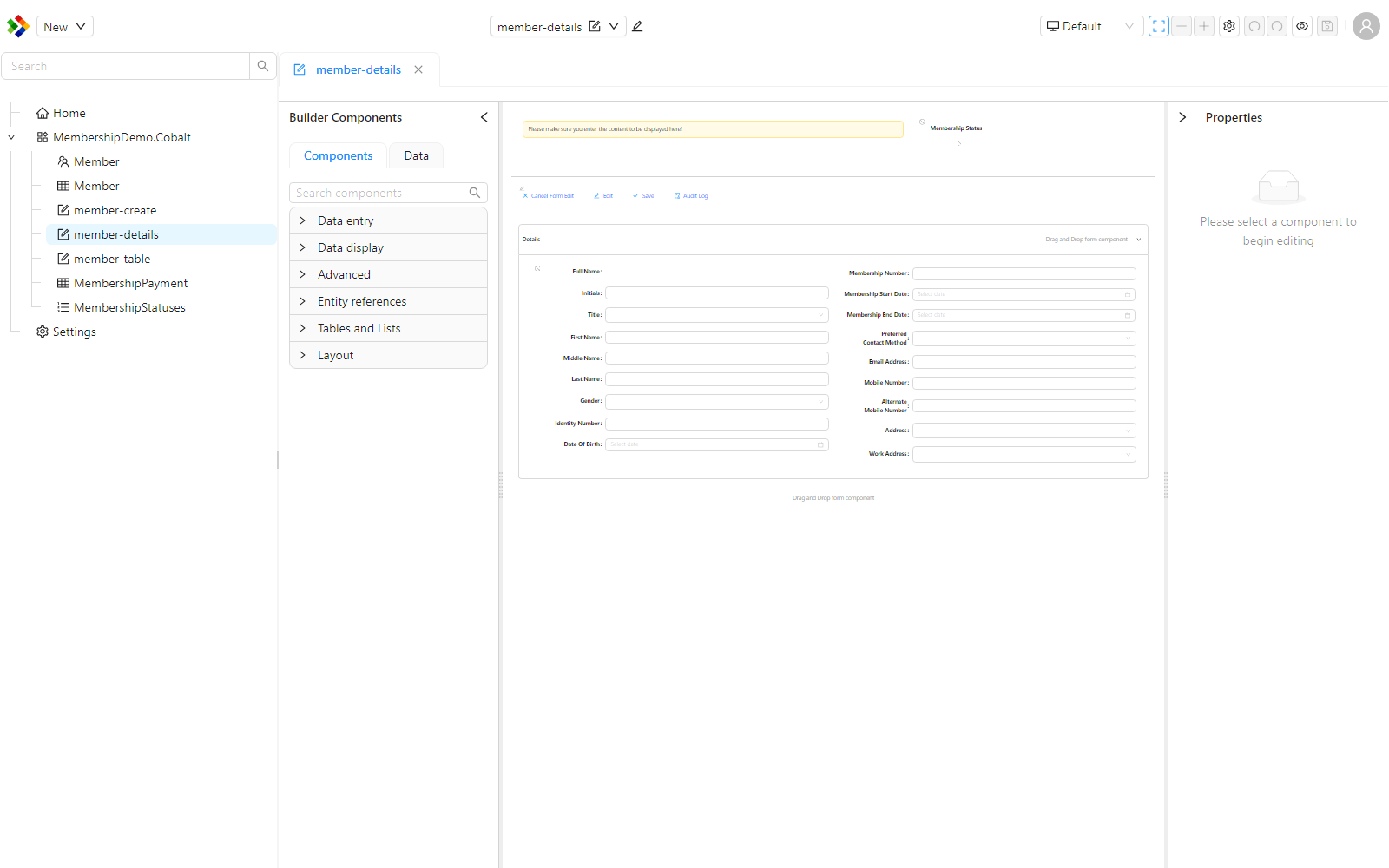
Zooming and scrolling
The canvas can be zoomed in and out, and scrolled, so you can work on a detailed area or step back to see the whole form. The zoom controls sit on the designer toolbar.
| Control | What it does |
|---|---|
| Zoom in | Increases the zoom level. |
| Zoom out | Decreases the zoom level. |
| Auto zoom | Fits the form to the available space. While auto zoom is on, the manual zoom buttons are disabled. |
The current zoom level is shown as a percentage, and zoom ranges from 25% to 200%. You can also zoom with a pinch gesture on a touch device, or by holding Ctrl while scrolling the mouse wheel.
Turn on auto zoom to fit the entire form into view, then switch to manual zoom when you want to focus on a particular section.
Pre-configured components on drop
Some components are awkward to start from an empty shell, so a template version of them inserts a ready-made structure rather than a blank component when dropped onto the canvas.
- The toolbox includes a DataTable (Full) template, separate from the plain DataTable component. Dropping it inserts a full table structure, including the surrounding data context, a toolbar with Add, Open, Edit, and Export buttons, a quick search box, a pager, and action columns.
- The DataList component is designed to show the same kind of pre-configured layout - a title, status, description, and metadata - but it does so by defaulting to an external form reference (
dummy-datalist-item) rather than inserting a template tree directly. Whether you see a populated layout immediately after dropping it depends on that form existing in your application.
This lets you see the structure and layout of the DataTable template component the moment you drop it, instead of having to configure it from nothing before anything appears.
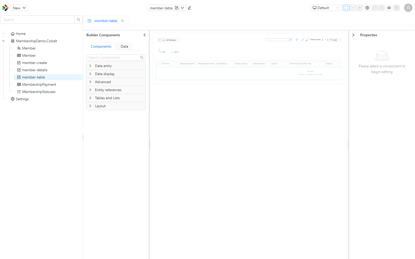
The dropped DataTable template shows the component's structure and layout with placeholder bindings. It is a configured starting point that you then bind to your own data, not live sample records.
Configuration indicators
When a component on the canvas has a configuration issue, the designer shows a small icon on the component rather than an inline error message. Hover over the icon to read the detail.
The current designer shows a single, uniform icon for any configuration issue - there is no separate colour coding for warnings versus informational hints.
This keeps the canvas readable while still drawing your attention to the components that need work.