Entity Reference
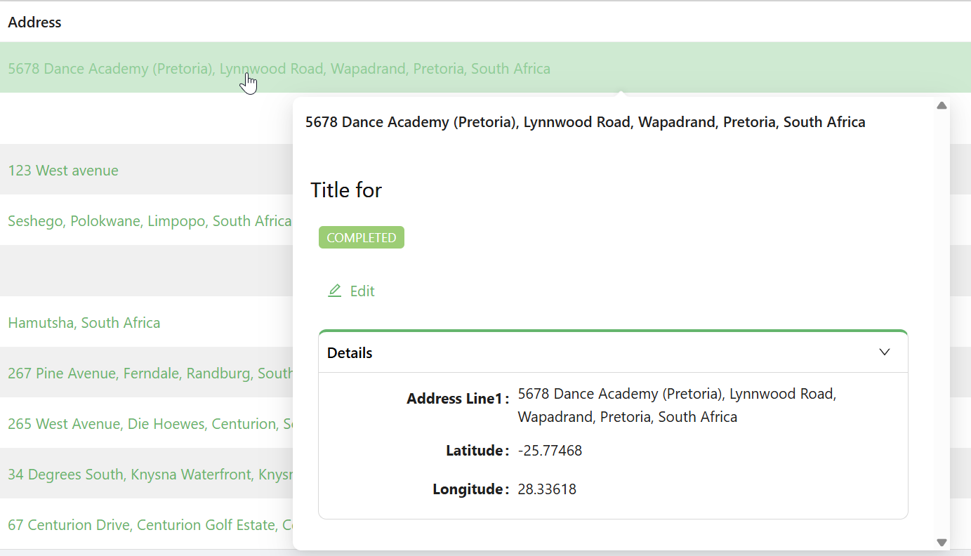
The Entity Reference component allows users to interact with a related record by linking to it through navigation, dialogs, or quickview modals. It’s ideal for referencing details or records without embedding the full form.
Get Started
NB: This guide assumes a Data Table is already set up. Learn how to configure it here.
Properties
The following properties are available to configure the behavior of the component from the form editor (this is in addition to common properties).
Data
Entity Type string
Specifies the type of entity being referenced. (Required)
Get Entity URL string
API endpoint used to retrieve full entity details.
Display Type object
Choose what content to show:
- Display Property (default)
- Icon
- Text Title
Entity Reference Type object
Determines interaction method:
- Quickview (default)
- Navigate Link
- Dialog
Form Selection Mode object
Controls how the form is selected:
- Name (default)
- Dynamic
Form Type string
Used for dynamic form selection.
Quickview Width number
Sets the width of the quickview modal in pixels.
Appearance
Layout object
-
Label Col
number: Column span for the label. -
Wrapper Col
number: Column span for the input/display.