Color Picker
The Color Picker component lets users pick a colour from a visual palette, or type in their own hex, RGB, or HSB value. Use it wherever a form needs to capture a colour, for example a category colour or a themed status indicator.
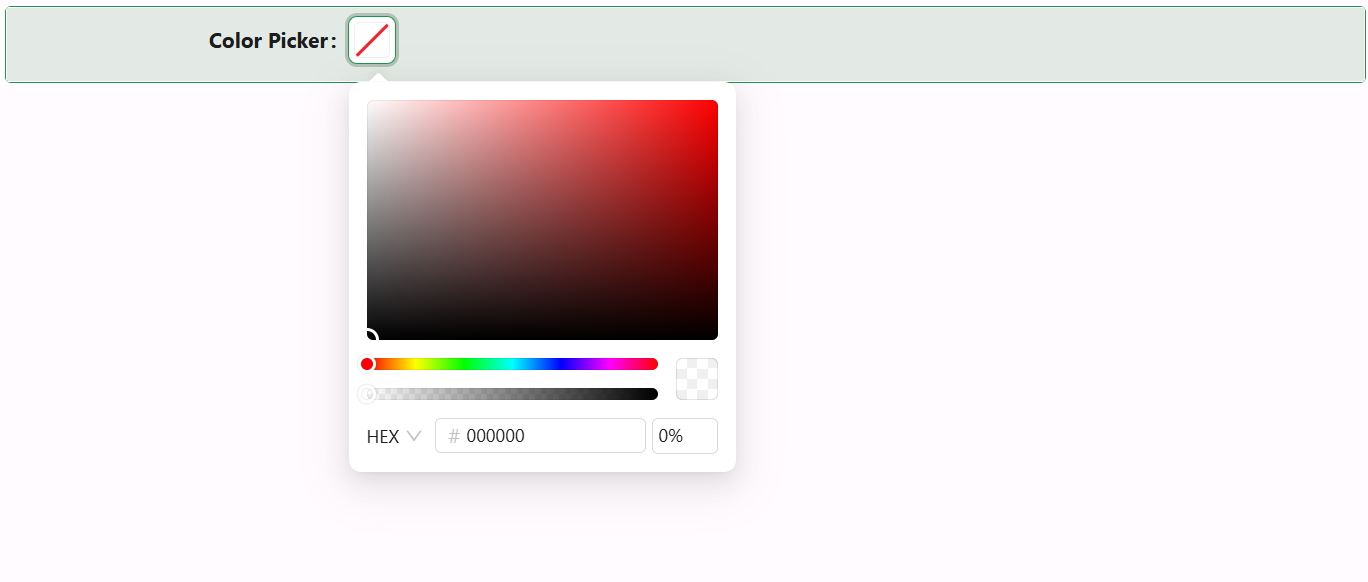
The value can also be one of the application's theme colour keywords - primary, success, warning, error, info, or processing - instead of a literal colour string. When the bound value matches one of these keywords, the picker resolves and displays the application's actual theme colour for it rather than treating the keyword as a raw colour value.
Properties
The following properties are available to configure the behavior of the component from the form editor (this is in addition to common properties).
Data
Title string
Text shown at the top of the picker's popover panel, above the colour palette itself.
Allow Clear boolean
Adds a clear button that resets the selected colour to empty.
Show Color Code boolean
Shows the colour's value (in whichever format - hex, RGB, or HSB - the user last switched to in the picker) as text alongside the colour swatch.
Disable Opacity boolean
Removes the alpha/transparency slider from the picker, restricting selection to fully opaque colours.
Events
On Change function
Fires when the user picks a new colour, receiving the newly selected colour value alongside the standard script variables.
Appearance
Color Picker's Appearance tab exposes Size (Small/Middle/Large), Margin & Padding, and Custom Styles.