Color Picker
The Color Picker component lets a user pick a colour from a visual palette, or type a value in directly, and stores it as a hex, HSB, or RGB string. Use it wherever a form needs to capture a colour value, such as a category colour or a theme setting.
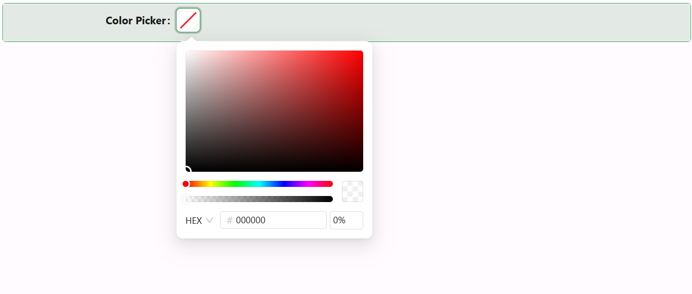
Properties
The properties below are listed in the order they appear on the Display panel, followed by Security (which holds only the standard Permissions setting, not covered further here).
Display
Property name string
The property this component reads and writes its selected colour value to.
Label string
The label text shown next to the component. Unlike the common Label setting, there's no separate toggle to hide it - leave this field blank to show no label at all.
Label align object
Aligns the label to the left or right of the component.
Title string
An optional caption shown above the palette when the picker's panel is open, set via a text area so longer captions can wrap.
Hidden boolean
A plain on/off checkbox that hides the component. Unlike the common Hide setting, this cannot be driven by a JavaScript expression - there's no scriptable mode.
Hide Label boolean
Hides the label without hiding the component itself.
Edit Mode object
Controls whether the component is editable, read-only, or inherits its editability from the form, the same Edit Mode setting used across other components.
Allow clear boolean
Adds a clear button that resets the value to empty.
Show text boolean
Shows the colour's text value (in whichever format - hex, HSB, or RGB - the user last selected in the picker) next to the swatch, once a value is set.
Disable Alpha boolean
Removes the opacity/alpha slider from the picker panel, restricting selection to fully opaque colours.