Dropdown
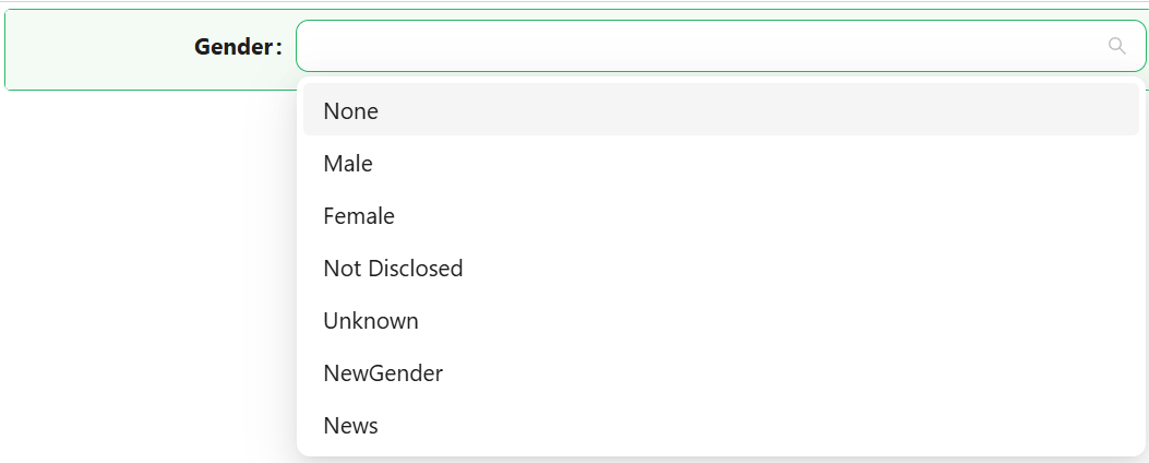
The Dropdown component lets users pick one or more values from a list. The list can be a fixed set of label/value pairs you define yourself, or a reference list defined on the backend, and the component can display its selected values as plain text or as coloured tags.

Properties
The following properties are available to configure the behavior of the component from the form editor (this is in addition to common properties).
Data
Mode object
Whether the user can pick a single value (Single) or several at once (Multiple).
Data Source Type object
Where the list of options comes from:
| Option | Description |
|---|---|
| Values | A fixed list of label/value pairs you define directly on the component. |
| Reference list | The options come from a reference list defined on the backend. |
The underlying data model allows a 'url' data source type, but the live settings panel only ever offers Values and Reference list as choices - there is currently no way to select a remote URL as a Dropdown's data source from the designer.
Values array
Only shown when Data Source Type is Values. Define each option as a label, a value, and optionally a colour and an icon.
Reference List object
Only shown when Data Source Type is Reference list. Pick the reference list this Dropdown draws its options from.
Items Filter object
Only shown when Data Source Type is Reference list. Restricts which items of the reference list are offered, using the same query builder used elsewhere in Shesha.
Value Format object
Only shown when Data Source Type is Reference list. Controls what gets stored in the bound property:
| Option | Description |
|---|---|
| Simple item value | Stores the reference list item's raw integer value. |
| Reference list item | Stores the full reference list item object. |
| Custom | Reveals Key Value and Custom Value script fields, letting you compute the stored value yourself. |
Item Custom Label function
Only shown when Data Source Type is Reference list. A script that returns the label to display for an item, overriding the reference list item's own name.
Disable Item Value boolean
Only shown when Data Source Type is Reference list. When enabled, reveals Disabled Values, a list of item values that appear in the list but cannot be selected.
Ignored Values string
A comma or array-style list of item values to exclude from the list entirely (rather than just disabling them). This field appears twice in the live settings panel - once inside the Reference list options, and once further down the Data tab gated behind Disable Item Value - both write to the same property.
Appearance
The Appearance tab starts with two settings that apply regardless of display mode:
Enable Style On Readonly boolean
When the component becomes read-only, this controls whether its full configured styling still applies, or only its font and dimensions. Hidden when Mode is Single and Display Style is Tags.
Display Style object
Whether selected values are shown as Plain text or as Tags (coloured pill-shaped labels).
When Display Style is Tags and Mode is Single, the component's standard appearance controls are replaced entirely by a Custom Tag Styles panel: its own Font, Dimension, Border, Background (with a Show Solid Color toggle switching between a fully-coloured tag and a subtle tint-with-border look), Shadow, and Style script - all scoped to the tag's own appearance rather than the component's outer box. Switching Display Style back to Plain text (or Mode to Multiple) restores the component's standard appearance controls in place of that panel.