Radio
The Radio component lets users pick a single option from a small, always-visible set of choices. Its options can come from a fixed list you type in, a reference list, or a URL you fetch at runtime.

Properties
The following properties are available to configure the behavior of the component from the form editor (this is in addition to common properties).
Data
Data Source Type object
Chooses where the radio options come from:
| Option | Description |
|---|---|
| Values | Define label/value pairs directly in a dialog editor. |
| Reference list | Populate options from a selected reference list. |
| API URL | Fetch options from a custom endpoint at runtime. |
Items object
Only shown when Data Source Type is Values. Opens a dialog editor for typing in label/value pairs directly.
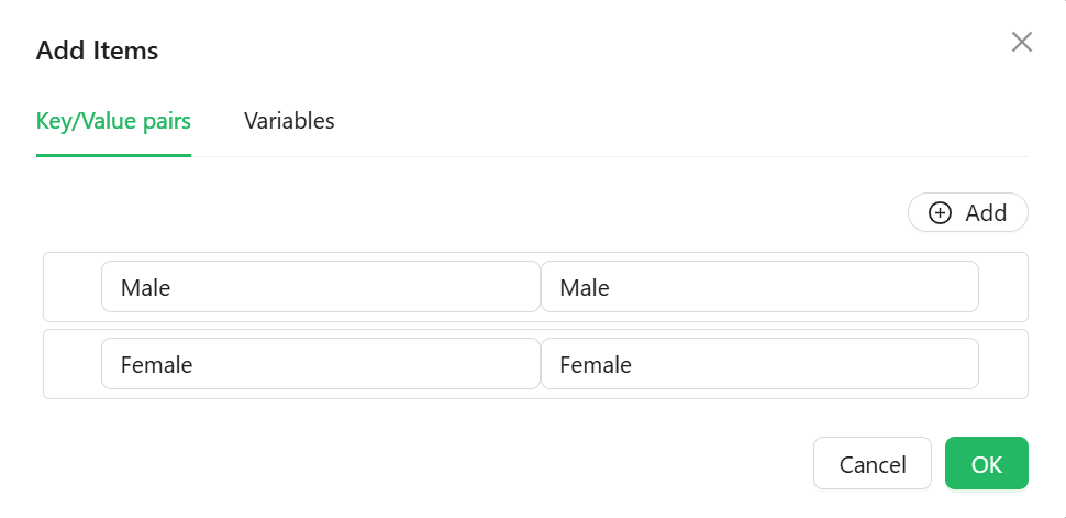
Reference List object
Only shown when Data Source Type is Reference list. Picks which reference list supplies the options. If the component's Property Name is bound to a reference-list-typed entity property, this is filled in automatically.
Data Source URL function
Only shown when Data Source Type is API URL. A script that returns the URL to fetch options from.
Reducer Function function
Only shown when Data Source Type is API URL. A script that reshapes the raw fetched response into the label/value pairs the component needs.
Form type to use: Any form type - Radio is available everywhere standard script variables are.
Example - Map a custom API response into label/value pairs:
return data.map(item => ({ label: item.displayName, value: item.code }));
Appearance
Radio's Appearance tab is unusually thin - it only exposes:
Enable Style On Readonly boolean
When off (the default), the component drops most of its visual styling once it becomes read-only, keeping only its typography. Turn this on to keep the full style applied even when read-only.
Direction object
Lays the options out Horizontal (the default) or Vertical.
Style function
A script that returns the style of the element as an object. Alongside Direction and Enable Style On Readonly, this is the only styling control for this component.