Wizard
The Wizard component enables multi-step forms by segmenting fields across several pages with navigation controls. It's ideal for complex data entry processes where progressive disclosure improves the user experience.

Get Started
Properties
The following properties are available to configure the behavior of the component from the form editor (this is in addition to common properties). Wizard groups its settings into Common, Appearance, and Security tabs (Security holds only the standard Permissions setting, not covered further here).
Common
Wizard Type string
Sets the layout style:
- Default (default)
- Navigation
Direction object
Defines orientation of the step bar:
- Vertical
- Horizontal (default - this is Ant Design's own default when no value is set)
Label Placement object
Controls how step labels are positioned:
- Vertical
- Horizontal (default - this is Ant Design's own default when no value is set)
Default Active Step object
The step that should be active on load, chosen from a dropdown of the steps you've configured. Defaults to the first step.
Configure Steps
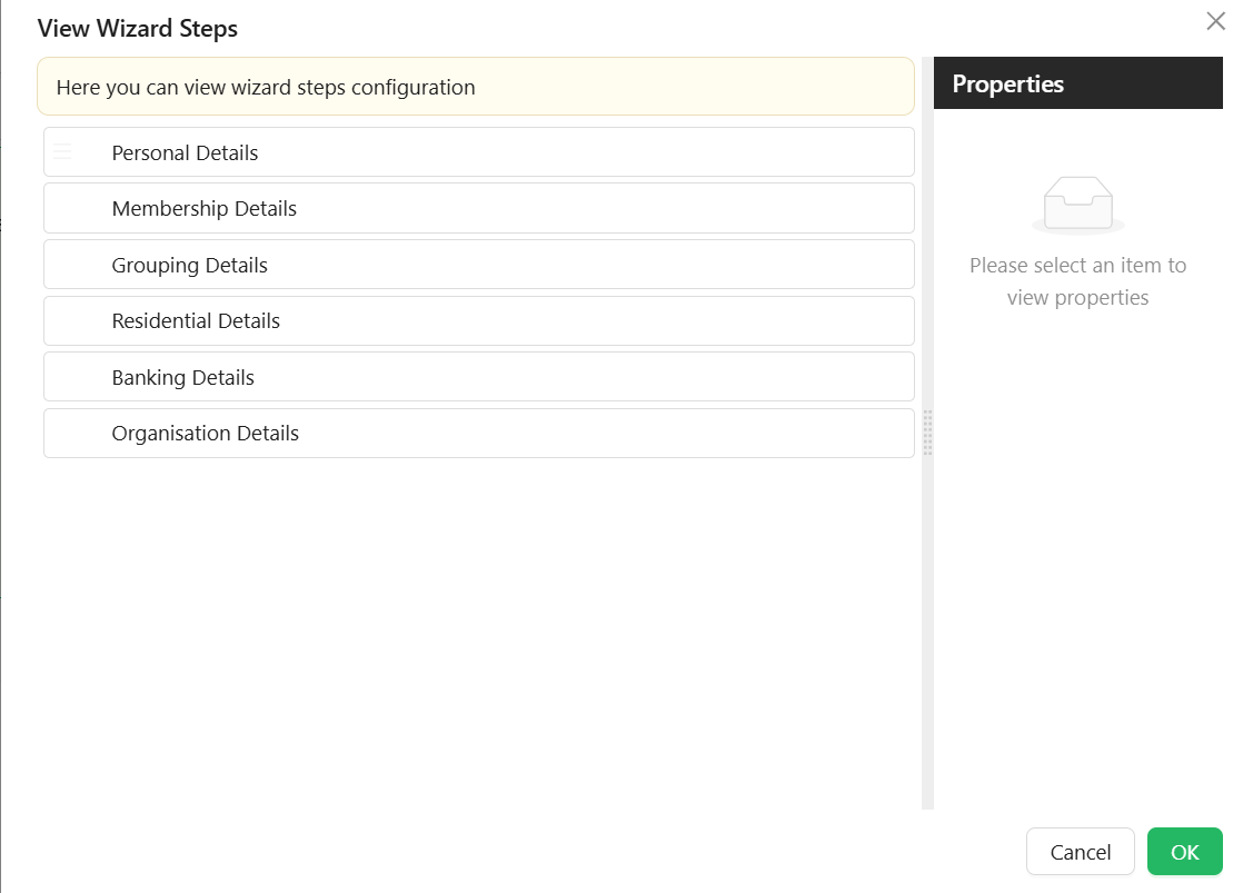
List of steps with their titles, icons, and content configuration. Each step's own settings panel has Common, Appearance, and Security tabs.
Common
- Name
string– Internal identifier for the step (this field is labelled "Name" on the live panel, not "Component Name"). - Title
string– Step title shown in the wizard UI. - Subtitle
string- Step subtitle is a secondary heading or a supporting piece of text that provides additional context or information related to the main title. - Description
string- Step description is a more extensive piece of text that elaborates on the details introduced in the title and subtitle. It provides a comprehensive explanation or additional information. - Key
string– Unique key for the step. - Icon
object- Users can select an icon to be displayed on each wizard step. - Allow Cancel
boolean- When set to true, this property enables a cancel button for the wizard step. The behavior is determined based on the configurations defined in the cancel event. - Can Skip To
boolean– Whether this step can be skipped to from other steps. - Custom Footer
boolean– When enabled, the standard Next/Back/Done/Cancel button row is replaced by a drop zone you can fill with your own components, for this step only. The Next Button, Back Button, Done Button, and Cancel Button panels below are hidden while this is on.
Button Titles
Each button title can be customized to meet business requirements. Each Wizard Step has 4 button panels, hidden while Custom Footer is enabled:
- Next Button
- Text
string– This is the title of the Next button. - Custom Enabled
function- Code that returns whether the Next button is enabled. - Before Next Action
function- An action triggered before the step moves to the next one. - After Next Action
function- An action triggered after the step has moved to the next one.
- Text
- Back Button
- Show Back Button
boolean– Whether the Back button appears on this step at all (defaults to shown). - Text
string– This is the title of the Back button. - Custom Enabled
function- Code that returns whether the Back button is enabled. - Before Back Action
function- An action triggered before the step moves to the previous one. - After Back Action
function- An action triggered after the step has moved to the previous one.
- Show Back Button
- Done Button
- Show Done Button
boolean– Whether the Done button appears on the final step at all (defaults to shown). - Text
string– This is the title of the Done button. - Custom Enabled
function- Code that returns whether the Done button is enabled. - Before Done Action
function- An action triggered before the wizard completes the final step. - After Done Action
function- An action triggered after the wizard has completed the final step.
- Show Done Button
- Cancel Button
- Text
string– This is the title of the Cancel button. - Custom Enabled
function- Code that returns whether the Cancel button is enabled. - Before Cancel Action
function- An action triggered before the cancel event occurs. - After Cancel Action
function- An action triggered after the cancel event occurs.
- Text
After any of the button events, you can handle both success and failure.
On Before Render
function - An action triggered before the step renders.
Other
Two further scripted settings sit in an "Other" panel:
- Custom Visibility
function- Code that returns whether this step appears in the wizard at all. Returntrueto show the step. Use this to hide an entire step conditionally, similar to a Hide condition on a regular component. - Custom Enabled
function- Code that returns whether this step itself is enabled. Returningfalsedisables the whole step (the user cannot interact with its fields) rather than a specific button.
Example - Disable a step until its mandatory fields are filled in:
if (form.formMode != "designer") {
  //this is to prevent movement to the next step while on the form designer
  return (
    isValidProperty(data.firstName) &&
    isValidProperty(data.lastName) &&
    isValidProperty(data.emailAddress1)
  );
}

function isValidProperty(value) {
  return value !== undefined && value !== "";
}
Appearance
Each step also has its own Font, Border, Background, Shadow, Margin & Padding, and Custom Styles (Class Name and Style) panels, styling that step's own content area independently of the wizard's own Appearance settings below.
Security
Each step has its own Permissions field, restricting which users can see that specific step - separate from the Wizard component's own Permissions setting.
Using JS code
You can use JS script of some controls (Buttons, etc.) to manage Wizard Component
| Value | What it holds |
|---|---|
current | The index of the current step, counting from zero |
currentStep | The current step, as an IWizardStepProps object |
visibleSteps | The steps currently visible, as an array of IWizardStepProps |
api | The actions listed below |
interface IWizardStepProps {
  id: string;
  icon?: string;
  key: string;
  title: string;
  subTitle: string;
  description: string;
  allowCancel?: boolean;
  label?: string;
  name?: string;
  tooltip?: string;
  permissions?: string[];
  childItems?: IWizardStepProps[];
}
Actions to move between steps:
form.components.wizardName.api.next()- to the next stepform.components.wizardName.api.back()- to the previous stepform.components.wizardName.api.done()- finish the wizard (execute Done configurable actions)form.components.wizardName.api.cancel()- cancel the wizard (execute Cancel configurable actions)form.components.wizardName.api.close()- close the wizard's containing modal, if it is inside oneform.components.wizardName.api.reset()- reset back to the wizard's starting stepform.components.wizardName.api.setStep(index)- move to the step with Index (will be executedOn Before Renderconfigurable action)
Appearance
The Appearance tab is a per-device property router with the standard Font, Dimensions, Border, Background, Shadow, Margin & Padding, and Custom Styles (Style script only) panels described in common properties, plus an Additional Styles panel below.
Additional Styles
-
Step Width
string- the width of each step marker in the step bar. Accepts any CSS unit (%, px, em, etc), px by default if no unit is given. -
Button Layout
string: Layout direction of navigation buttons. (Left, Right, Space between) -
Primary Color
object: Main highlight color. -
Primary Text Color
object: Text color for primary elements. -
Secondary Color
object: Secondary accent color. -
Secondary Text Color
object: Text color for secondary elements.