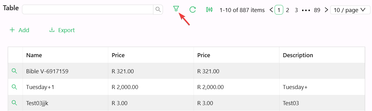
Table Filter
The Table Filter component is a customizable filter button designed to help users quickly refine table data. It supports diverse configurations including layout, icons, tooltips, and custom action triggers—perfect for dynamic table filtering on dashboards or forms.
Properties
The following properties are available to configure the behavior of the component from the form editor (this is in addition to common properties).
Common
Icon object
Name of an optional icon displayed on the button.
Danger boolean
Adds a red style to indicate a destructive action.
Block boolean
Expands the button to take up full width of its container.
Action Configuration object
Defines the behavior triggered when the button is clicked.
Appearance
Button Type object
Controls the visual style:
- Primary
- Ghost
- Dashed
- Link
- Text
- Default (default)