Custom Components
Overview
The Shesha Form Builder is a versatile tool that offers a wide range of form components to cover most common scenarios. However, to meet unique requirements, Shesha allows the creation of custom components. These custom components can be seamlessly integrated into the Form Builder, enabling easy addition via a drag-and-drop interface.
Background
The Shesha Form Builder uses a JSON schema to assemble the form structure. Once the schema is available, it is injected into the builder, where it is interpreted to render components with their specific configurations.
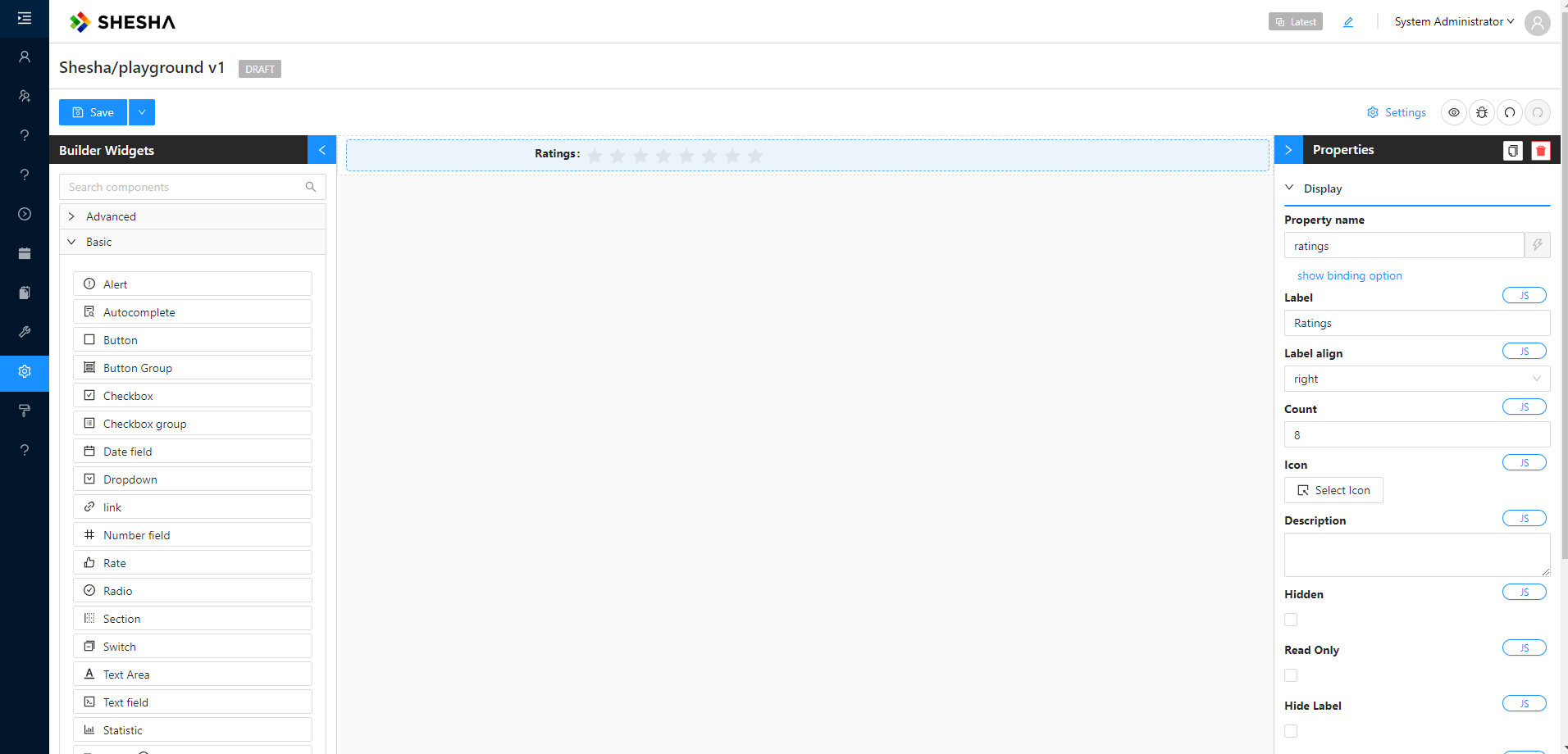
Example JSON Schema
{
  "components": [
    {
      "id": "LAuoz8VcEzPdMTc5zFK-n",
      "type": "rate",
      "propertyName": "ratings",
      "componentName": "ratings",
      "label": "Ratings",
      "labelAlign": "right",
      "parentId": "root",
      "hidden": false,
      "isDynamic": false,
      "version": 1,
      "count": 8,
      "settingsValidationErrors": []
    }
  ],
  "formSettings": {
    "layout": "horizontal",
    "colon": true,
    "labelCol": {
      "span": 6
    },
    "wrapperCol": {
      "span": 18
    }
  }
}
NOTE: The JSON schema above shows two properties:
components(an array of form components) andformSettings. If there are multiple components in the UI form, they would appear as additional entries within thecomponentsarray.
Folder Structure
Shesha adopts a monorepo structure with NPM workspaces, allowing shared dependencies between multiple projects or modules within a single application.
- The root workspace directory is typically named
packages, where all relevant modules are stored. - Within the
srcfolder, we need to add three new folders: thecomponentsfolder,designer-components, and theprovidersfolder.
📁 Components Folder
This folder contains the core implementation of the component.
src/components/custom-card/index.tsx
Contains the standard.tsxfile with the UI logic and necessary props for thecustom-cardcomponent.
📁 Designer Components Folder
This folder is responsible for integrating the component into the Shesha Framework and making it configurable for other developers. This is done successfully by adding the designer component to an array of components within the src\designer-components\index.tsx.
-
src/designer-components/custom-card/index.tsx
Wraps the core component and registers it with the Shesha design system, including metadata such as the component name and settings. -
src/designer-components/custom-card/settingsForm.tsx
Provides a configuration form that allows developers to customize the component's behavior and appearance through a UI.
📁 Providers Folder
-
Components are exposed through the
index.tsxfile inside\src\providers\custom-plugin, which needs to be wrapped around the main application's provider.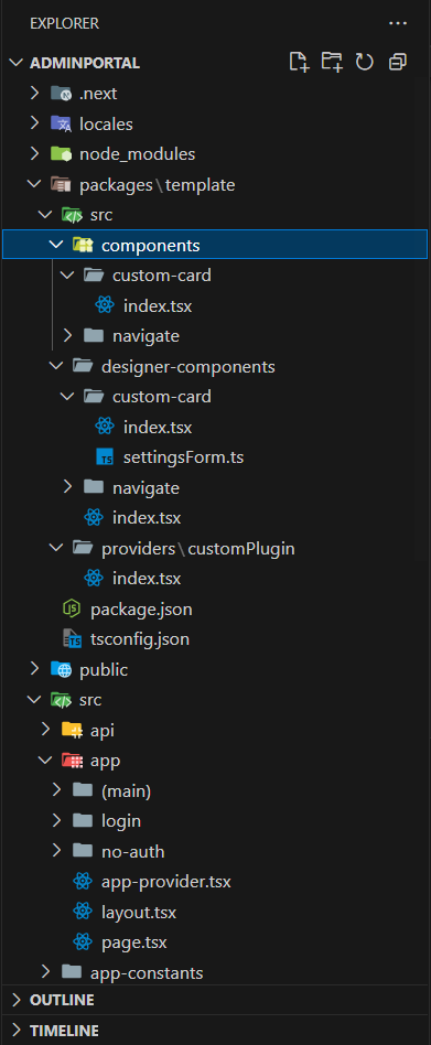
Example Code: Exposing Components
import { useSheshaApplication } from "@shesha-io/reactjs";
import { TheComponents } from "../../designer-components";
import React, { PropsWithChildren, useEffect } from "react";

export const REPORTING_PLUGIN_NAME = "Custom-Plugin";

export interface ICustomPluginProps {}

export const CustomPlugin: React.FC<PropsWithChildren<ICustomPluginProps>> = ({
  children,
}) => {
  const { registerFormDesignerComponents } = useSheshaApplication();

  useEffect(() => {
    registerFormDesignerComponents(REPORTING_PLUGIN_NAME, TheComponents);
  }, []);

  return <>{children}</>;
};
Viewing Exposed Components
To view the list of exposed components in the Shesha Form Builder, open Custom Components via the builder widgets, as shown in the image below:
-e8ab113bac28dad4c0545c028e149d8a.png)
Data Structure
The src\designer-components\index.tsx file uses an array to group components. This structure allows for organizing multiple component modules when needed.
The array is typed using the IToolboxComponentGroup interface, ensuring that the correct structure is followed. It is recommended to type TheComponents as demonstrated in the example below:
Example Code: TheComponents
import { IToolboxComponentGroup } from "@shesha-io/reactjs";
import CalendarComponent from "components/global/bookingCalendar/formComponent";
import FacilityContextPickerComponent from "components/global/facilityContextPicker/formComponent";
import StatsListComponent from "components/global/statsList/formComponent";
import TableFormComponent from "components/global/tableBuilder/formComponent";
import UrinalysisComponent from "components/global/urinalysis";
import SampleComponent from "components/global/urinalysis";

import { IToolboxComponentGroup } from "@shesha-io/reactjs";
import CustomCardComponent from "./custom-card";
import CustomNavigationComponent from "./navigate";

export const TheComponents: IToolboxComponentGroup[] = [
    {
        name: "Custom Components",
        components: [CustomCardComponent, CustomNavigationComponent],
        visible: true
    }
]
NOTE: An example of this folder structure can be found here.
Component Definition
In this example, we will demonstrate the standard way of creating a component in Next.js, including the use of typed props that extend the IConfigurableFormComponent interface from the Shesha Framework.
Note: This component will be handled by the Factory method within the custom-card designer component.
Example Component: CustomCard
import { IConfigurableFormComponent } from "@shesha-io/reactjs";
import React from "react";

export interface ICustomCard extends IConfigurableFormComponent {
  title: string;
  description: string;
  imageUrl?: string;
  footer?: React.ReactNode;
}

const CustomCard: React.FC<ICustomCard> = ({ title, description, imageUrl, footer }) => {

    return (
    <div style={{ border: "1px solid #ddd", borderRadius: 8, padding: 16, maxWidth: 350 }}>
      {imageUrl && (
        <img src={imageUrl} alt={title} style={{ width: "100%", borderRadius: 4, marginBottom: 12 }} />
      )}
      <h3>{title}</h3>
      <p>{description}</p>
      {footer && <div style={{ marginTop: 16 }}>{footer}</div>}
    </div>
  );
};

export default CustomCard;
Designer Component Definition
The custom-card component must implement the IToolboxComponent interface to maintain consistency within the Form Builder, and this rule applies to all custom components. One more thing to point out is the Factory method—this is the method that will return our custom card JSX from the components folder.
Example Component: CustomCard
import React from "react";
import CustomCard, { ICustomCard } from "../../components/custom-card";
import { settingsForm } from "./settingsForm";
import { IdcardOutlined } from "@ant-design/icons";
import {
  ComponentFactoryArguments,
  ConfigurableFormItem,
  IToolboxComponent,
  validateConfigurableComponentSettings,
} from "@shesha-io/reactjs";

const CustomCardComponent: IToolboxComponent<ICustomCard> = {
  type: "CustomCard",
  icon: <IdcardOutlined />,
  isInput: false,
  isOutput: true,
  name: "Custom Card",
  Factory: ({ model }: ComponentFactoryArguments<ICustomCard>) => {
    return (
      <ConfigurableFormItem model={model}>
        {(value, onchange) => (
          <CustomCard
            title={model.title}
            description={model.description}
            type={model.type}
            imageUrl={model.imageUrl}
            id={model.id}
          />
        )}
      </ConfigurableFormItem>
    );
  },
  initModel: (modal) => ({
    ...modal,
    title: "Hello Shesha",
    description: "sample",
    imageUrl:
      "https://www.w3schools.com/images/w3schools_green.jpg",
  }),
  settingsFormMarkup: settingsForm,
  validateSettings: (model) =>
    validateConfigurableComponentSettings(settingsForm, model),
};

export default CustomCardComponent;
Key Properties of IToolboxComponent:
Type: Unique identifier for the component.Name: Displayed in the toolbox, often set as the default label.Icon: The icon shown in the toolbox.Factory: A method that returns a JSX element and defines how the component is rendered in the form.Settings: Used to configure form-specific settings like size, label visibility, etc.initModel: Initial values can be defined and will be applied during the form configuration initialization.
Form Configuration
- The
settingsFormproperty defines the component's configuration, typically displayed in the side menu or metadata section of the builder. DesignerToolbarSettingsis a helper class for building configurations. To create a configuration, simply add the appropriate method to the class and provide the necessary options. Then, import the configuration settings and inject them into the builder.
Example: settingsForm Configuration
import { DesignerToolbarSettings } from '@/interfaces/toolbarSettings';
import { nanoid } from '@/utils/uuid';
import { FormLayout } from 'antd/lib/form/Form';

export const getSettings = (data: any) => {
    const searchableTabsId = nanoid();
    const commonTabId = nanoid();
    const dataTabId = nanoid();

    return {
        components: new DesignerToolbarSettings(data).addSearchableTabs({
            id: searchableTabsId,
            propertyName: 'settingsTabs',
            label: 'settings',
            hideLabel: true,
            labelAlign: 'right',
            size: 'small',
            tabs: [
                {
                    key: 'common',
                    title: 'Common',
                    id: commonTabId,
                    components: [...new DesignerToolbarSettings()
                        .addContextPropertyAutocomplete({
                            id: nanoid(),
                            propertyName: 'propertyName',
                            parentId: commonTabId,
                            label: 'Property Name',
                            size: 'small',
                            validate: {
                                required: true
                            },
                            styledLabel: true,
                            jsSetting: true,
                        }).toJson()
                    ]
                },
                {
                    key: 'data',
                    title: 'Data',
                    id: dataTabId,
                    components: [...new DesignerToolbarSettings()
                        .addPropertyAutocomplete({
                            id: nanoid(),
                            propertyName: 'title',
                            label: 'Title',
                            parentId: dataTabId,
                            validate: {
                                required: true
                            },
                            jsSetting: true,

                        }).addPropertyAutocomplete({
                            id: nanoid(),
                            propertyName: 'imageUrl',
                            label: 'ImageUrl',
                            parentId: dataTabId,
                            validate: {
                                required: false
                            },
                            jsSetting: true,
                        })
                        .addPropertyAutocomplete({
                            id: nanoid(),
                            propertyName: 'description',
                            label: 'Description',
                            parentId: dataTabId,
                            validate: {
                                required: true
                            },
                            jsSetting: true,
                        }).toJson()
                    ]
                }
            ]
        }).toJson(),
        formSettings: {
            colon: false,
            layout: 'vertical' as FormLayout,
            labelCol: { span: 24 },
            wrapperCol: { span: 24 }
        }
    };
};
-42f79655fa94035405600e8a760891a2.png)
Factory Method
The factory property is a key method in the IToolboxComponent interface. It returns a JSX element and handles rendering in the form.
How Factory Works:
- The
factorymethod takes aComponentFactoryArgumentsobject as an argument. The primary property of interest ismodel, which holds the component's configuration values. - The
ConfigurableFormItemcomponent is responsible for managing the form's state, validation, visibility, and more.
NOTE: It is important to note that
ConfigurableFormItemis a form item and is responsible for handling state, validation, visibility, and many more features in the Shesha Form Builder.
Example of Factory Method Usage:
const CustomCardComponent: IToolboxComponent<ICustomCard> = {
  type: "CustomCard",
  icon: <IdcardOutlined />,
  isInput: false,
  isOutput: true,
  name: "Custom Card",
  Factory: ({ model }: ComponentFactoryArguments<ICustomCard>) => {
    return (
      <ConfigurableFormItem model={model}>
        {(value, onchange) => (
          <CustomCard
            title={model.title}
            description={model.description}
            type={model.type}
            imageUrl={model.imageUrl}
            id={model.id}
          />
        )}
      </ConfigurableFormItem>
    );
  },
  initModel: (modal) => ({
    ...modal,
    title: "Hello Shesha",
    description: "sample",
    imageUrl:
      "https://www.w3schools.com/images/w3schools_green.jpg",
  }),
  settingsFormMarkup: (data) => getSettings(data),
};

export default CustomCardComponent;
Rendering the Factory Property
The factory property includes the ConfigurableFormItem component as its top-level parent. While using ConfigurableFormItem is not mandatory, it is the preferred approach. The children of ConfigurableFormItem receive a function with two parameters: value and onChange.
value: Represents the current value of the active component.onChange: The event handler that triggers value changes.
The function that is the child of ConfigurableFormItem must return the component that will be rendered in the form builder. The component can either receive values directly or ignore them, depending on the specification. In the provided example, the values from the model are directly passed to the components.
Model
The model contains the component's configuration values (e.g., title, size, border settings). The model is passed to the ConfigurableFormItem, and it reflects changes made via the form builder interface.
Example of Model Definition:
import { IConfigurableFormComponent } from "@shesha-io/reactjs";

export interface ICustomCard extends IConfigurableFormComponent {
  title: string;
  description: string;
  imageUrl?: string;
  footer?: React.ReactNode;
}
Exposing Component
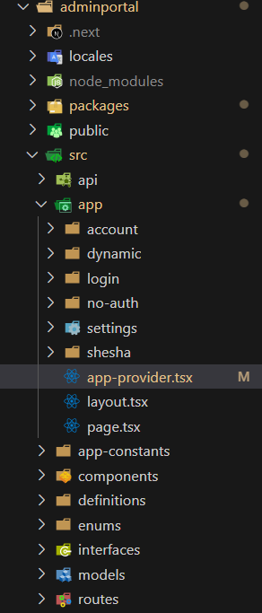
To expose custom components, wrap your application's root provider with the Custom-Plugin. This step makes the components available in the form builder.
Navigate to the app-provider.tsx file located in the adminportal directory: src --> app --> app-provider.tsx
Example: Wrapping with Custom-Plugin
"use client";

import React, { FC, PropsWithChildren} from "react";
import {
  GlobalStateProvider,
  ShaApplicationProvider,
  StoredFilesProvider,
  useNextRouter,
} from "@shesha-io/reactjs";
import { AppProgressBar } from "next-nprogress-bar";
import { useTheme } from "antd-style";
import { CustomPlugin } from "../../packages/template/src/providers/customPlugin";

export interface IAppProviderProps {
  backendUrl: string;
}

export const AppProvider: FC<PropsWithChildren<IAppProviderProps>> = ({
  children,
  backendUrl,
}) => {
  const nextRouter = useNextRouter();
  const theme = useTheme();

  return (
    <GlobalStateProvider>
      <AppProgressBar height="4px" color={theme.colorPrimary} shallowRouting />
      <ShaApplicationProvider
        backendUrl={backendUrl}
        router={nextRouter}
        noAuth={nextRouter.path?.includes("/no-auth")}
      >
        <CustomPlugin>
          <StoredFilesProvider baseUrl={backendUrl} ownerId={""} ownerType={""}>
            {children}
          </StoredFilesProvider>
        </CustomPlugin>
      </ShaApplicationProvider>
    </GlobalStateProvider>
  );
};