Radio
The Radio component lets a user pick exactly one option from a small set of choices, shown as a group of radio buttons. Use it instead of a Dropdown when there are only a handful of options and you want all of them visible at once, so the user can compare them without opening a menu.

Properties
The following properties are available to configure the behavior of the component from the form editor (this is in addition to common properties).
Display
Hidden is a plain on/off checkbox rather than a scripted expression.
Data
Default Value string
A value to pre-select when the form loads and the bound property has no value yet.
Data Source Type object
Controls where the radio options come from:
| Option | Description |
|---|---|
| Values | Options you type in directly, as label/value pairs. |
| Reference List | Options are the items of a Shesha reference list. |
| API Url | Options are fetched from a custom API endpoint. |
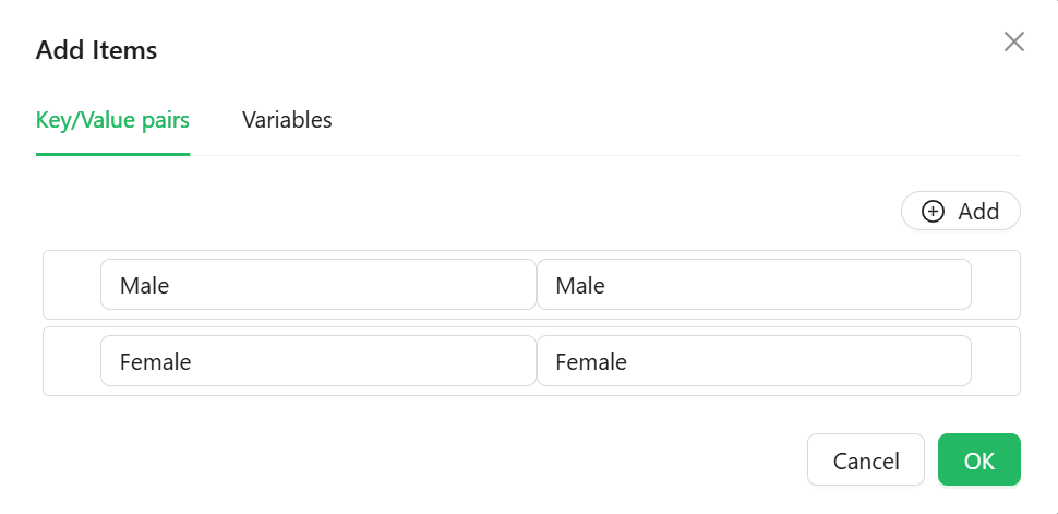
Values
Shown when Data Source Type is Values. Use Items to define each option's label and value directly in a dialog editor - no code or backend list required.
Reference List
Shown when Data Source Type is Reference List. Pick the reference list in the Reference List field; its items (value and display text) become the radio options automatically.
API Url
Shown when Data Source Type is API Url:
- Data Source Url - a script that returns the endpoint to call. Has
data(form values) andglobalStateavailable. - Reducer function - a script that reshapes the API response into an array of
{ value, label }objects. Receives the raw response array asdata.
The Radio component builds its request with useGet and expects the response to be either an array directly, or an object with a result or result.items array - the Reducer function runs on whichever of those it finds.
Direction object
Lays the options out Vertically (stacked) or Horizontally (in a row).
Events
On Change function
Fires when the selected option changes. This is the only event Radio exposes.