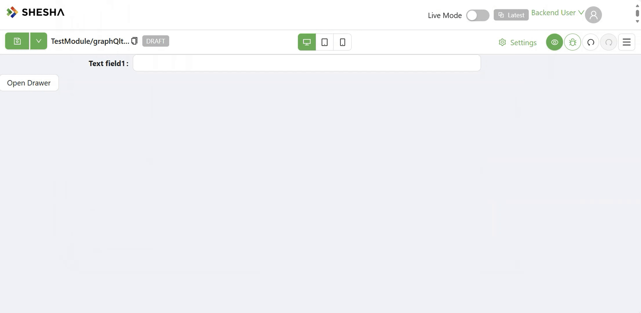
Drawer
The Drawer component allows the opening of a sliding panel from any side of the screen, ideal for temporary form content, quick settings, or auxiliary views. It supports extensive customization around behavior, size, positioning, and content.
Properties
The following properties are available to configure the behavior of the component from the form editor (this is in addition to common properties).
Common
Show Header boolean
Controls visibility of the drawer's header.
Show Action Buttons boolean
Toggles display of the drawer's action buttons (footer).
Appearance
Slide Direction object
Specifies the animation direction for how the drawer appears:
- Right (default)
- Top
- Bottom
- Left