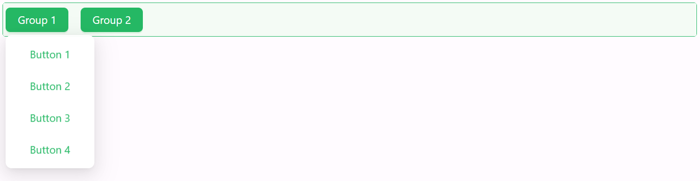
Button Group
The Button Group component offers a flexible way to present a set of action buttons in a single row or column layout. With options for layout orientation, spacing, and complete styling control, it’s ideal for organizing grouped actions in a visually consistent manner.

Properties
The following properties are available to configure the behavior of the component from the form editor (this is in addition to common properties).
Common
Configure Button Group object
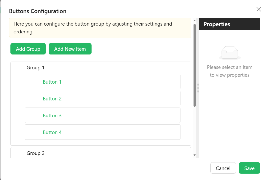
Configure button groups and items using a visual builder. Optionally supports expression logic for visibility or customization. This array may include two kinds of entries: Group Items and Button Items, each with its own configuration.
Group Item
Used to group multiple buttons under a common label or logic.
-
Group Name
string– Internal identifier for the group. -
Label
string– The title for the button group. -
Group Tooltip
string– Tooltip displayed when hovering over the group. -
Icon
object– Optional icon for the group label. -
Down Icon
object– Optional dropdown icon to indicate collapsibility. -
Button Type
object– Button style type for the group:- Link (default)
- Primary
- Ghost
- Dashed
- Text
-
Edit Mode
object– Controls interaction within the group:- Editable
- Read Only
- Inherited (default)
-
Hide
boolean– Hides the entire group. -
Hide When Empty
boolean– Automatically hides the group if no visible buttons remain.
Button Item
Used to define individual buttons.
-
Item Type
string– Defines the button's behavior:- Button (default)
- Separator
- Dynamic Items
-
Name
string– Internal identifier for the button. -
Caption
string– Label or descriptive text shown on the button. -
Tooltip
string– Helper text displayed on hover. -
Icon
string– Optional icon shown beside the caption. -
Edit Mode
object– Controls interaction for the button.- Editable
- Read Only
- Inherited (default)
-
Hide
boolean– Determines whether the button is hidden.
Is Button Inline boolean
Displays buttons as inline-flex elements to keep them aligned in a single line.
Appearance
Gap object
Spacing between buttons:
- Small
- Medium
- Large