Key Information Bar
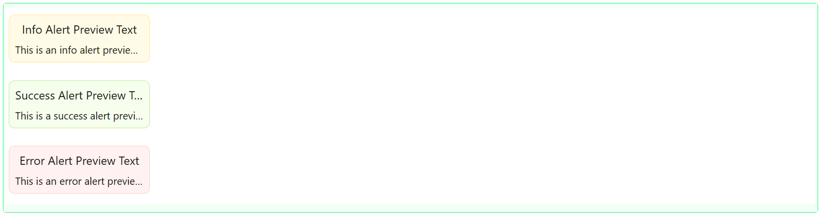
The Key Information Bar component lays out a row (or column) of separate content areas side by side, each separated by a configurable divider line. Use it for a strip of key stats, labels, or mixed content that should sit in evenly-spaced columns, with full control over each column's own layout and contents.

Properties
The following properties are available to configure the behavior of the component from the form editor (this is in addition to common properties). Key Information Bar uses the standard tabbed Common, Appearance, and Security layout.
Common
Columns array
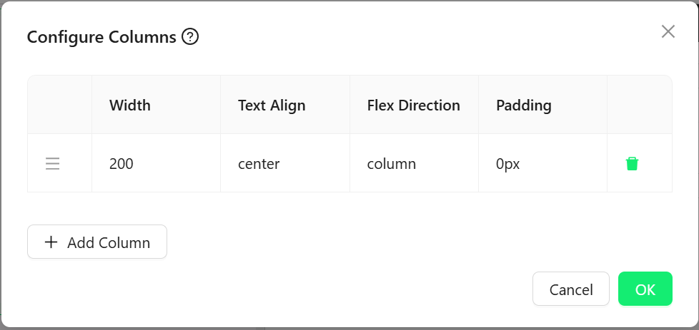
Opens a Configure Columns dialog where you add, delete, and drag-reorder the columns that make up the bar. Each column is its own drop target that can hold any other components, and has its own:
| Setting | What it controls |
|---|---|
| Width | The column's width in pixels |
| Text Align | How the column's contents are aligned (center, start, end, inherit) |
| Flex Direction | Whether the column's own contents stack in a row or a column |
| Padding | Padding inside the column |
A new Key Information Bar starts with a single 200px-wide column, centered, with its contents stacked as a column.
Hidden function
A visibility toggle with the scriptable "fx" option enabled, so it can be set as a plain on/off checkbox or replaced with a JavaScript expression that returns true or false.
Appearance
Two settings here are unique to Key Information Bar, shown before the rest of the tab:
Orientation object
Defines the layout direction:
| Option | Behaviour |
|---|---|
| Horizontal | Columns are laid out in a row, side by side. |
| Vertical | Columns are stacked one above the other. |
Align Items object
Only shown when Orientation is Horizontal. Aligns the columns within the bar: Flex Start, Flex End, or Center.
Gap function
The spacing between columns. Scriptable via the "fx" toggle.
The rest of the tab has the standard Dimensions, Border, Background, Shadow, and Margin & Padding panels (no separate Font panel), and Custom Styles exposes only the Style script.
Divider
A dedicated panel controlling the line drawn between columns:
Divider Margin function
The space around the divider line.
Divider Height function
Only shown when Orientation is Horizontal. The height of the divider line.
Divider Width function
Only shown when Orientation is Vertical. The width of the divider line.
Divider Thickness function
How thick the divider line is.
Divider Color string
The colour of the divider line.
Divider Margin, Width, Height, and Thickness are all scriptable ("fx") fields, so each can be a fixed value or a JavaScript expression.