Tabs
The Tabs component is used to organize content into separate sections or panes, where users can switch between these sections by clicking on the tabs. Each tab represents a different section, and only one section is visible at a time.

Properties
The following properties are available to configure the behavior of the component from the form editor (this is in addition to common properties).
Common
Default Active Tab enum
Choose which tab should greet your users first. This dropdown lets you set the initial active tab based on tab configurations.
Tab Type card | line
Defines the visual style of your tabs.
-
Card (default): Each tab looks like a clickable card.
-
Line: Sleek underline style for the minimalists.
Tabs
Configure Tab Panes
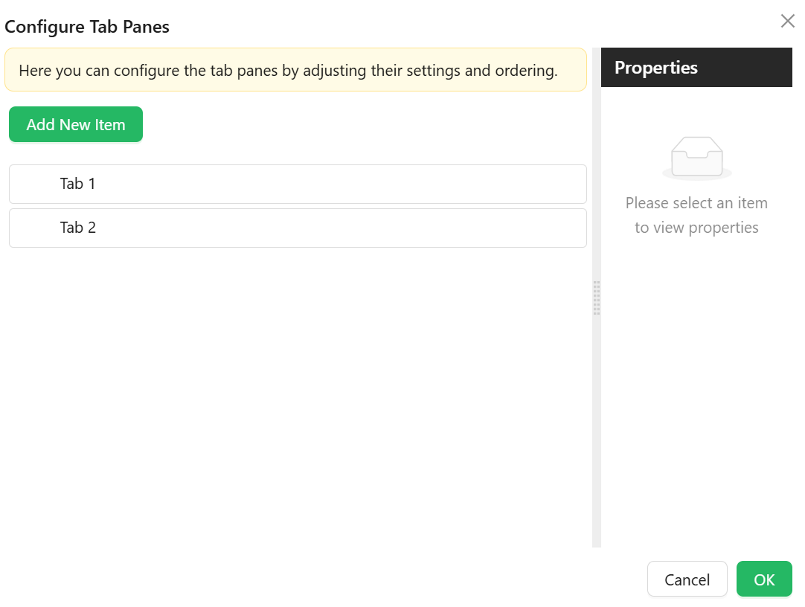
The configure tabs option can be used to add the tabs that at user wants to have. An array of tab configuration objects. Each tab supports:
- Name
string– Internal identifier used to reference the tab. - Title
string– Text displayed on the tab label. - Key
string– Unique key for the tab. - Class Name
string– Optional CSS class applied to the tab. - Animated
boolean– Enables animation transitions when switching tabs. - Icon
object– Optional icon shown beside the title. - Force Render
boolean– Forces rendering of tab content even when inactive. - Hide
boolean– Conditionally hides this specific tab. - Edit Mode
object– Defines whether tab content is editable:- Editable
- Read Only
- Inherited (default)
- Select Mode
object– Tab selection behavior:- Selectable (default)
- Disabled
- Inherited from Edit Mode
- Destroy Inactive Tab Pane
boolean– Whether to remove DOM of inactive tabs.
Appearance
Position string
Set where your tabs appear:
- Top (default)
- Bottom
- Left
- Right
Card Styles object
For when using Card tab type:
- Font styles specific to card content
- Dimensions (width, height, min/max)
- Background types and image settings
- Custom styles just for the card view