Drawer
The Drawer component is a panel that slides in from an edge of the screen to show content on top of the form, without navigating away from it. Use it for things like a quick-edit form, supplementary details, or an action that doesn't need a full page.
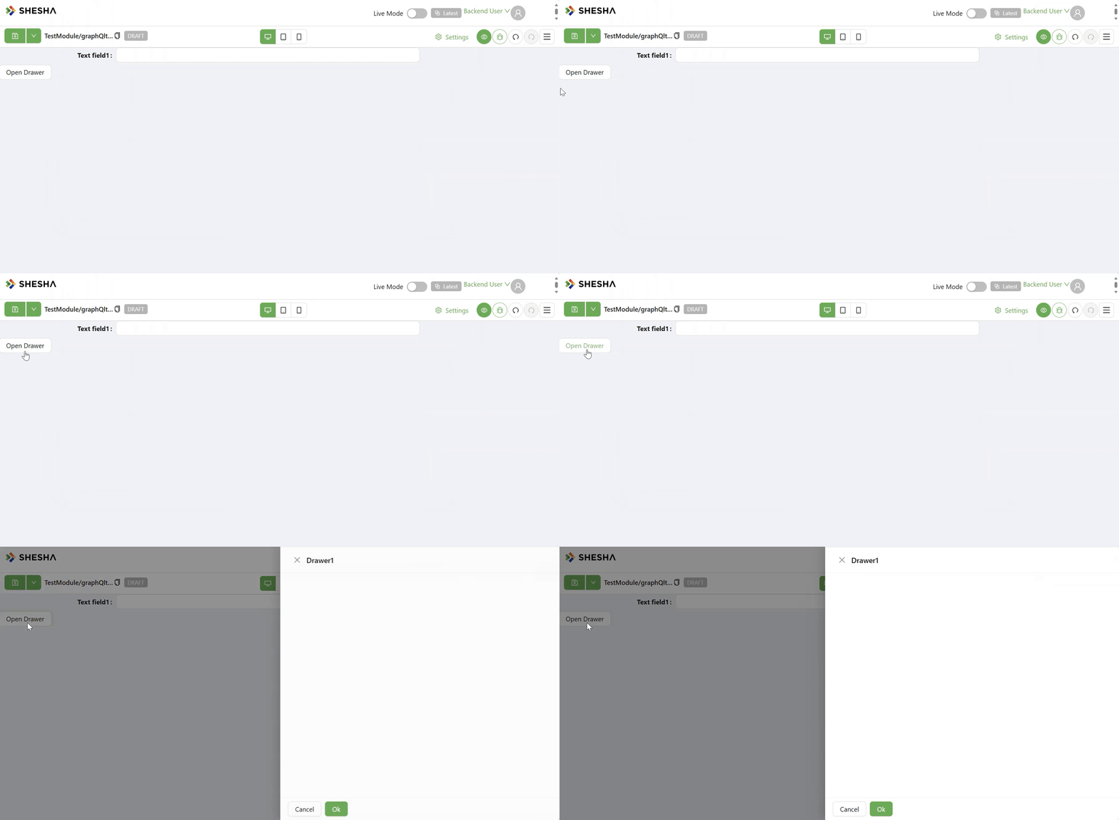
Unlike most container components, a Drawer does not open on its own and has no click behaviour of its own. It starts closed, and only opens or closes when a Button (or any other component with an Execute Action) is configured to run the Open drawer or Close drawer action, using this Drawer's Component Name as the action's target.
In the form designer, the Drawer is shown as a plain inline panel with a warning banner, so you can still see and edit its contents. It only renders as an actual sliding drawer when the form is running (Edit, Create, or Details mode).
Properties
The following properties are available to configure the behavior of the component from the form editor (this is in addition to common properties). Drawer has no Security tab, so it does not support the Permissions setting most other components do.
Common
Component Name string
This is the name you target when configuring a Button's Execute Action to open or close this Drawer.
Header Title string
The text shown in the Drawer's header. Only shown when Show Header is enabled.
Show Header boolean
Toggles whether the Drawer displays a header bar with the Header Title.
Show Action Buttons boolean
Toggles whether the Drawer displays a footer with Ok and Cancel buttons. Turning this on reveals two collapsible panels, Ok Button and Cancel Button, each with:
| Field | What it does |
|---|---|
| Ok Action / Ok Cancel | A Configurable Action run when the button is clicked |
| Ok Text / Cancel Text | The text shown on the button (defaults to "Ok" / "Cancel") |
| Custom Enabled | A script returning whether the button is enabled |
Form type to use: Any form type - the Drawer is a layout component available wherever standard script variables are.
Example - Close the Drawer from its own Cancel button:
Set the Cancel Button's Ok Cancel (Cancel Action) to Execute Action, targeting Close drawer on this Drawer's Component Name.
Appearance
The Appearance tab is a per-device property router, same as most other components.
Slide Direction object
Which edge of the screen the Drawer slides in from: Top, Right (default), Bottom, or Left.
Body Styling
The Drawer's own body has its own set of Dimensions, Background, Border, Shadow, Margin & Padding, and Custom Styles controls, independent from the Header Styles and Footer Styles below.
Header Styles object
Only shown when Show Header is enabled. A separate Background, Shadow, and Style script scoped to the header bar only, independent of the Drawer body's own styling above.
Footer Styles object
Only shown when Show Action Buttons is enabled. A separate Background, Shadow, and Style script scoped to the Ok/Cancel button footer only, independent of the Drawer body's own styling above.