SizableColumns
The SizableColumns component splits its area into a row of columns that the end user can resize by dragging the divider between them at runtime. Use it when a fixed-width Columns layout is too rigid and users need to adjust how much space each side gets.


Properties
The following properties are available to configure the behavior of the component from the form editor (this is in addition to common properties). SizableColumns groups its settings into Common, Data, Appearance, and Security tabs (Common and Security hold only the standard properties, not covered further here).
Data
Columns object
Opens a Configure Columns dialog where you add, delete, and reorder the columns that make up the row.
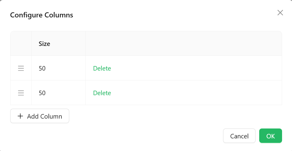
Each column only has one configurable value here: a relative Size number (columns default to 25 when added). This sets each column's initial share of the row's width, not a fixed pixel width - a column with Size 50 starts out twice as wide as one with Size 25. It is not a minimum or maximum boundary, and it does not carry any per-column styling.
Once the form is running, the user can drag the divider between any two columns to resize them, overriding whatever Size values you configured. There is no setting to lock columns at a fixed width or to cap how far a user can resize them.
Appearance
The standard Dimensions, Border, Background, Shadow, and Margin & Padding panels are all present. The one difference is in Custom Styles:
Style function
A script that returns the style of the element as an object, conforming to CSSProperties. There is no separate Custom CSS Class field alongside it.