Autocomplete
The Autocomplete component enhances user input fields with dynamic suggestions based on the user's typing. It is an input box with text hints, and users can type freely. The keyword is aiding input.

Properties
The following properties are available to configure the behavior of the component from the form editor (this is in addition to common properties).
Data
Disable Search boolean
Hides the search bar and disables real-time filtering.
Selection Mode string
Sets how many options can be selected:
- Single (default)
- Multiple
Data Source Type object
Choose source for suggestions:
- Entities List (default)
- URL
Entity Type string
Entity to search within.
Data Source URL string
External data source URL.
Value Prop Name string
Value property in external source.
Query Param string
Parameter for search queries.
Entity Filter object
Filter options using a query builder.
Custom Source URL string
Custom URL for fetching data.
Value Format string
How values are formatted:
- Entity Reference (default)
- Simple ID
- Custom
Display Property object
Property used to display selected value.
Display Value Function function (when Value Format is Custom)
Function to render display text.
Allow Free Text boolean (when Value Format is Simple ID)
Allow user to type custom text.
Key Value Function function (when Value Format is Custom)
Function for key value mapping.
Value Function function (when Value Format is Custom)
Function to get value.
Key Value Function function (when Value Format is Custom)
Function for key value mapping.
Filter Selected Function function (when Value Format is Custom)
Function to filter selected items.
Use Quickview boolean
Enable modal quickview for selections.
Fields to Fetch object
Additional fields to load.
Sort By object
Sorts options by a specified property.
Grouping object
Groups options by a property.
Autocomplete examples
The Autocomplete component can work with two types of list sources - standard Entities endpoints (Entities List Data Source Type) and custom endpoints (URL Data Source Type). Custom endpoints should support string term parameter for filtering data. The responses from the endpoints should be either a standard response with a list of entities or an array.
export interface ITableDataResponse {
    readonly totalCount: number;
    readonly items: object[];
}
• Entities List Data Source Type
If the standard entities endpoint is used, the backend returns list of entities with items in the following format
{
    "id": "d519b92f-86e9-4f0f-8df4-00aae8a43158",
    "_className": "Shesha.Domain.Person",
    "_displayName": "Alex Stephens"
}
If you specify a value for Display Property, the received data will contain an additional field that will be used as name of items. For example Display Property = firstName
{
    "id": "d519b92f-86e9-4f0f-8df4-00aae8a43158",
    "_className": "Shesha.Domain.Person",
    "_displayName": "Alex Stephens",
    "firstName": "Alex"
}
• Entity reference Value format
If you will use Entity reference Value format then the selected value will be stored in the model as
{
    "autocomplete": {
        "id": "d519b92f-86e9-4f0f-8df4-00aae8a43158",
        "_className": "Shesha.Domain.Person",
        "_displayName": "Alex Stephens"
    }
}
• Simple ID Value format
If you will use Simple ID Value format then the selected value will be stored in the model as
{
    "autocomplete": "d519b92f-86e9-4f0f-8df4-00aae8a43158"
}
If you specify a value for KeyProperty, the received data will contain an additional field that will be used as selected value. For example Display Property = firstName, Key Property = lastName
// Received item
{
    "id": "d519b92f-86e9-4f0f-8df4-00aae8a43158",
    "_className": "Shesha.Domain.Person",
    "_displayName": "Alex Stephens",
    "firstName": "Alex",
    "lastName": "Stephens"
}

// Selected value
{
    "autocomplete": "Stephens"
}
• URL Data Source Type
• Simple ID Value format
Standard format of response from custom endpoints
// Received item
{
    "value": 1,
    "displayText": "First option"
}

// Selected value
{
    "autocomplete": 1
}
But you can use source with any other format of items. To do this, you need to specify in Display Property the field that will be used as the name of items and in Key Property the field that will be used as the value.
• General Display value Function
Regardless of the selected value of Data Source type you can use Display value Function. This is a script to get the displayed name of items. In this script, you can use any field from the received data. For Entities list mode, you can request additional fields using the Fields to fetch setting. For URL mode you can use only fields provided by the endpoint.
//#region Exposed variables
import {
item
} from './displayValueFunc.variables';
//#endregion
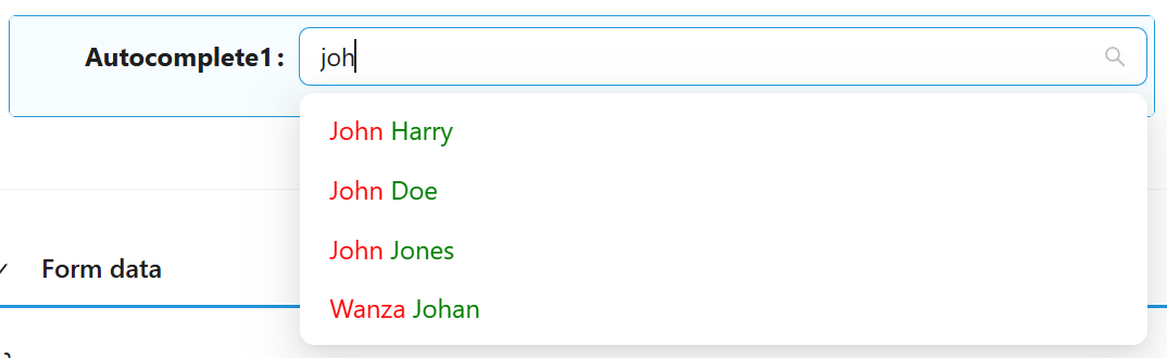
const displayValueFunc = () => {
return `<span style="color: red">${item.firstName}</span> <span style="color: green">${item.lastName}</span>`;
};
• General Custom Value format
Regardless of the selected value of Data Source type you can use Custom Value format.
Without additional settings or with only Display Property and Key Property settings, this mode is similar to SimpleID Value format.
To set up a custom mode, you can use the following methods:
Value Function - uses Item value received from the backend to return value in custom format.
Key value Function - uses value in custom format to return key value. Used with Key Property Name to create filter for request data
Display value Function - gets the display name of items. You can use Display Property instead or leave them empty to use standard display properties
Example
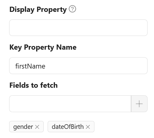
Configure Autocomplete to get additional fields (firstName, gender, dateOfBirth). Use firstName as Key property.
Configure Value function to return value in custom format
const outcomeValueFunc = () => {
    return `${item.firstName}|${item.gender}|${item.dateOfBirth}`
};
Now, when selecting a list item, the value will have a custom format.
{
  "autocomplete": "Alex|1|2088-06-06T00:00:00"
}
Configure Key value function to get correct Key value (needed to get correct item from the backend). Take first element from split value as this is firstName
const keyValueFunc = () => {
    return value?.split('|')[0];
};
Advanced filtering
In the example above, we use only one firstName field. However, one field may not be enough to uniquely identify an item. For more accurate identification, you can use Filter selected Function. This method returns a filter in JsonLogic format for more accurate selection of an element on the backend.
const filterSelectedFunc = () => {
    const parts = value?.split('|');
    if (parts.length < 2)
        return null;
    return {
        and: [
            {"==":[{"var":"firstName"}, parts[0]]},
            {"==":[{"var":"gender"}, Number(parts[1])]}
        ]
    };
};
This script uses two fields as a compound key for filtering.