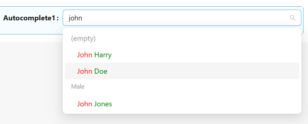
Autocomplete
Autocomplete is used when you need an input box instead of a selector. It is an input box with text hints, and users can type freely. The keyword is aiding input.
Properties
The following properties are available to configure the behavior of the component from the form editor (this is in addition to common properties.
Selection Mode
Set mode of selection. Options: Single (Single value), Multiple (Array of values)

Disable search
The component will work as a simple Dorpdown
Data Source Type
Where the component should source the data to be displayed as options. Options: Entities List, URL
Entity Type
Drop down of all the entities available in the systems to bind to the component as options
Entity Filter
The JavaScript Query Builder is a rich and responsive UI for filtering large amounts of data by creating or editing conditions. It outputs structured JSON filters that can be easily parsed to create SQL queries. It allows you to create conditions and group them using AND/OR logic. This was explained in an earlier section. Implementation can be found here.
Custom Source Url
Custom URL for getting data from a non-standard source
Value format
Format of field value
Simple Id - field value contains only simple Id, eg autocomplete1 : "7eaeebdb-e6df-4ed9-ae29-af0f833e1169"
Entity reference - field value contains object with additional Entity Reference data, eg autocomplete1 : { "id" : "7eaeebdb-e6df-4ed9-ae29-af0f833e1169", _className : "Shesha.Domain.Person", _displayName : "John Doe" }. Available only for Entities List Data Source Type.
Custom - formats of field value and formats of options can be configured by scripts (Key value Function, Value Function, Display value Function)
Display Property
Name of the property that should be displayed in the autocomplete. Live empty to use default display property defined on the back-end.
Display value Function
A script to get the displayed name of the elements. It can be used for custom display of options.


Key Property Name
Name of the property that should be used as a key. Live empty to use default key property (usually id)
Fields to fetch
Allows to specify entty properties that should be received from the backend.
To use firstName and lastName from the previous example need to get these properties from the backend
Sort By
Adds additional information to the request about sorting the data on the backend side before sending it.
Grouping
Allows to group options in the Autocopmlete list

Use Quickview
-
Entity display name displays the specified form in a Quickview on hover. This functionality is only possible on a details view (readonly). This is very useful in cases where the user would like to view more information about the linked entity in the form of a pop-up, however have the functionality to edit and change the value of the linked entity when on edit mode
Form Path
- This brings a dropdown list of all the forms that are available in the system and can be rendered as a quickview
Get Entity Url
- This is used in cases where you want to override the default ‘GET’ URL that is being utilized when the Entity Type has been selected.
Display Property Name
- Name of the property that should be displayed in the field. Leave empty to use the default display property defined in the backend
Width
- The display width of the quickview on hover